
Introduction
Typography quietly shapes how readable, trustworthy, and visually appealing a piece of design feels, whether it’s a website, a document, or a printed poster, and resources like thefontworld.com exist to help both beginners and experienced designers navigate the enormous range of available fonts. This article covers the fundamentals of choosing fonts well, common pairing mistakes, and practical tips for using typography effectively in everyday design projects.
Understanding Font Categories
Fonts generally fall into a few broad categories, each carrying a distinct visual tone. Serif fonts, featuring small decorative strokes at the ends of letters, tend to read as classic, formal, or trustworthy, and remain a common choice for print documents and traditional branding. Sans-serif fonts, without these decorative strokes, feel cleaner and more modern, which is part of why they dominate contemporary web design and digital interfaces. Beyond these two core categories, script fonts mimic handwriting and work well for accent or decorative use, while display fonts are designed for bold, attention-grabbing headlines rather than body text readability.
Why Font Choice Affects Readability
Beyond aesthetics, font choice has a genuine, measurable impact on readability, particularly for longer blocks of text. Fonts with clear, well-spaced letterforms and adequate contrast between letters reduce eye strain and reading fatigue, which matters significantly for body text in articles, books, or lengthy documents. Highly stylised or decorative fonts, while visually striking in small doses, generally become difficult to read at length, which is why most well-designed materials reserve decorative fonts for headlines or short accent text rather than extended body copy.
The Basics of Font Pairing
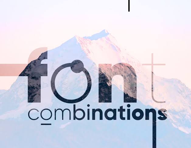
Combining fonts effectively is one of the trickiest parts of typography for many beginners. A commonly recommended starting approach is pairing a distinctive header font with a simpler, highly readable body font, creating visual hierarchy without sacrificing readability for the bulk of the text. Pairing a serif font with a complementary sans-serif, or vice versa, often creates pleasing contrast, while pairing two very similar fonts can look like an unintentional mismatch rather than a deliberate stylistic choice.
Common Font Pairing Mistakes
A few recurring mistakes show up frequently in font pairing. Using too many different fonts within a single design, generally more than two or three, tends to create visual clutter and inconsistency rather than intentional variety. Pairing fonts with dramatically different visual weights or styles without a clear hierarchy reason can look accidental rather than purposeful. Choosing fonts purely for novelty, without considering how they’ll actually read in the context they’ll be used, whether that’s a small mobile screen or a large printed banner, is another common oversight that undermines otherwise solid design work.
Considering Font Licensing
An often overlooked aspect of choosing fonts, particularly for commercial projects, is understanding font licensing. Many fonts, even those freely downloadable, come with specific licensing terms restricting their use for commercial projects, logo design, or embedding within software or apps without a paid license. Checking a font’s licensing terms before using it in client work, branding, or any commercial context is an important step that resources focused on typography, including guides like those on thefontworld.com, often emphasise to help avoid legal issues down the line.
Choosing Fonts for Different Contexts
The right font choice depends heavily on context. Web design generally favours fonts optimised for screen readability at various sizes, with good performance across different devices and browsers. Print design has more flexibility with detailed serif fonts, since print resolution doesn’t face the same rendering constraints as digital screens. Branding and logo design often call for a distinctive, memorable font choice that still remains legible at both large and small sizes, since a logo needs to work equally well on a large storefront sign and a small mobile app icon.
Accessibility Considerations in Font Choice
Beyond general readability, font choice also affects accessibility for readers with visual impairments or reading difficulties like dyslexia. Certain fonts are specifically designed with accessibility in mind, featuring distinct letterforms that reduce the chance of easily confused characters, along with generous letter spacing that improves readability for a broader range of readers. Considering these accessibility factors, particularly for content aimed at a broad general audience, reflects thoughtful, inclusive design practice beyond pure aesthetic preference.
Conclusion
Choosing and pairing fonts well comes down to understanding the tone different font categories convey, prioritising readability alongside visual appeal, and avoiding common pairing mistakes like overusing too many typefaces at once. Resources like thefontworld.com that break down these fundamentals can help both design beginners and experienced professionals make more intentional, effective typography choices across web, print, and branding projects.